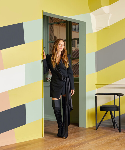
West Coast interior designer Kelly Wearstler, the go-to for Cameron Diaz and Gwen Stefani, has set her sights on a paint collection with Dorset, U.K.–based brand Farrow & Ball. “I’ve been using Farrow & Ball throughout my entire career,” says Wearstler. “We were lucky enough to be able to create the hues in person when I visited the factory in Dorset pre-COVID-19. I had never been to a paint factory before, and it was such an eye-opening and inspiring experience.” The 75-year-old design brand, with its highly pigmented, quality paints, was a perfect partner for Wearstler, who has designed the interiors for the Proper brand hotel properties in California and Texas. “I am continuously appreciative of the quality and craftsmanship that goes into their products. We both have a deep understanding and love for how color can create a dynamic space, so the partnership felt natural.” Farrow & Ball’s sustainability and environmentally friendly approach to paint (their products are water-based, have low VOCs and come in recycled metal containers) also appealed to Wearstler. “Kelly has such a fantastic aesthetic and taste,” says Farrow & Ball’s head of creative, Charlotte Cosby. “Her style is so synonymous with color and California. The result of the collaboration is a versatile collection of easily combined colors made with our signature richly pigmented formulations that really bring walls to life and transform with the light throughout the day—whether that light is the bright, warm tones of California or gray-blue light of British skies.”
The resulting paint color collection showcases warm natural hues (Faded Terracotta, Salt and Sand), blacks (Tar), grays (Stoke) and soft greens (Citrona and Palm), all inspired by the flora and fauna of Southern California. “The aesthetic is inherently California,” says Wearstler. “Natural, effortless luxury and bringing the outdoors inside. Every hue has a physical and/or emotional touchpoint to the California landscape.” So, how does Wearstler envision these colors living in one’s space? “Citrona is so bright and cheerful; I keep imagining it in a kitchen or family room, where you spend the most time with your family and loved ones,” she says.
But Wearstler always does her due diligence first to avoid mistakes. “One of the biggest mistakes is not considering the natural light in a room,” she cautions. “This really affects the color that you choose. It’s also really important to think about how the space interacts with those that it borders. You want to choose colors to form a hierarchy and natural transition between the different areas.” The relaxed and fresh paint hues fit in seamlessly with the brand’s 130-plus offerings and pave the way for modern, clean interiors for years to come.


