Once the province of artists, musicians and other renegades, the New York City loft has been so thoroughly glamourized in recent decades that it’s almost a shock to be reminded that these apartments do have their drawbacks. “The problem with these spaces, historically, is that they’re very dark,” notes the architect and interior designer Campion Platt. “These buildings were originally used for manufacturing,” so a large loft—like the 5,000-square-footer on the north side of Madison Square Park that he was hired to re-envision—is likely to have at least a few corners that are, as he puts it, “very far from a window.”
The challenge, then, was to create a floor plan that permits as much natural light as possible to permeate the space. “The building had been converted by the sponsor,” Platt explains, “and this was basically a finished apartment that we then proceeded to gut.” Prior to the renovation, he says, “the design was very broken-up. The entryway, for example, was completely closed-off; if you shut all the doors, it was a very dark space.”
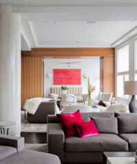
So, Platt says, he set about moving walls and reorganizing rooms, creating different pathways throughout the apartment in order to make it “breathe better.” The master closet was moved to the center of the apartment, “because a closet doesn’t need windows,” and the entryway was converted into a more gallery-like space, perfect for showing off certain key pieces from the
owners’ impressive collection of contemporary drawings, paintings, and photographs, which they assembled over the last several years with the help of art advisor Karen Amiel.
“The process was very specific to the space,” Amiel reports. “One mistake that’s often made in the hopeful marriage of art and architecture is that the scale is off. So we looked at the floorplans early on and we zeroed in on the walls that we thought would be optimum [places to display art]. We also thought about the sightlines—if two paintings are in the same field of vision, it’s important to think about the relationship between them, even if they’re thirty feet apart.” Despite these considerations, though, Amiel clarifies that the apartment’s owners don’t see the work of artists like Elliott Puckette, Terence Koh and Marilyn Minter as mere decoration. “They’re interested in exploring the intellectual content of the work.”
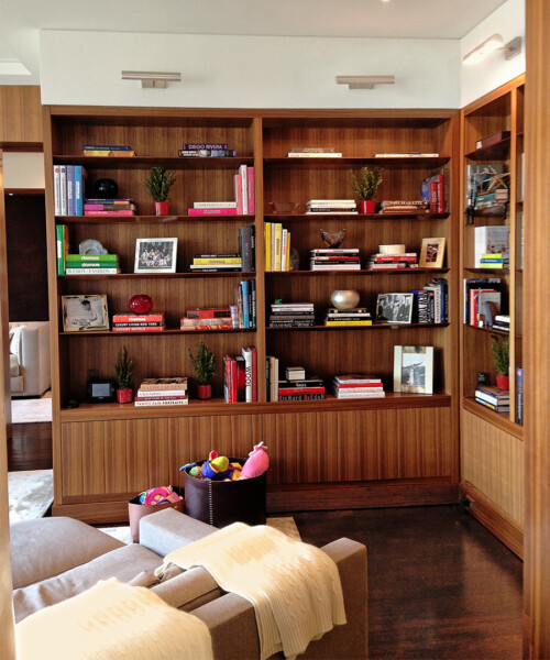
Aside from the art, the loft’s most distinctive feature is probably the custom millwork throughout, which is used to hide columns, define rooms, and, as Platt says, “soften the space; it makes it look more inviting and residential.” The wood—which is mostly American Walnut, chosen for its naturally warm hue—unifies the space, as do the few other materials used. “You can’t have too many tricks in an apartment,” explains the architect. “Three or four is the max. Here, we went with dark ebonized floors, chalk-white Venetian plaster walls, and anodized bronze trim.” The result is a loft that manages to be capacious without being the least bit cavernous.


