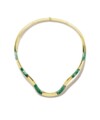
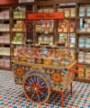
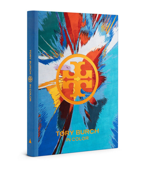
Organized by color, Tory Burch In Color (out now) illustrates Tory Burch’s lifestyle—from fashion to culture, entertaining, design, travel and beauty. Oh, and philanthropy: All gross proceeds from the sale of the book will benefit the Tory Burch Foundation, which supports the economic empowerment of women entrepreneurs and their families in the United States through low-cost loans, mentorship and entrepreneurial education.
Here, the designer talks with DuJour about her color inspirations.

Tory Burch
What’s your favorite color and why?
“Orange has been my favorite color since I was little. I always wanted to paint my bedroom coral, but my mother thought it was a little too much. (We painted it Kelly green.) I ended up getting my way years later when we opened our first boutique and used orange lacquer doors. That said, I also love cornflower blue or navy, especially when paired with crisp white.”
What’s your first memory of color?
“There are so many colors that I associate with my childhood. I remember them clearly: the pale pink button-down shirts my father wore with rolled-up khakis and espadrilles when he rode around the farm on his tractor; watching my mother get ready in a gold lamé top and pants from Zoran; my first bag in red, white and blue with stars.”
How do you live your life in color?
“I see the world in color and am drawn to the ways colors interact with and complement one another. And living in full color is my guiding principle—from the way I raise my children to the way I approach my work. It stems from how my parents raised my three brothers and me, to embrace differences in people and ideas and to surround ourselves with beauty and imagination.”
Do you organize your life by color?
“I probably do because I love playing around with color and pattern naturally. I have three teenaged boys, so there’s only so much I can do. But when I have dinner parties, I love setting the table—mixing and matching different place settings, linens, stemware and tureens and adding in fresh flowers from our garden.”
What’s your favorite color combination?
“I am immediately drawn to blue and white. I collect export china and spongeware—we just launched our own collection of spongeware—and use them every day. During the summer, I like big bunches of delphiniums and peegee hydrangeas in ginger jars and jugs. I have been fascinated with Iznik tilework ever since walking through Topkapi Palace in Istanbul—the colors are extraordinary.”
Matching or clashing?
“Both. Tonal pairs can be so affective, so can colors that are just a little bit off.”
Opaque or sheer?
“Opaque. I am always drawn to saturated colors—rarely sheer.”
What does your brand’s signature orange hue mean to you?
“Orange is happy and chic—there is nothing like the perfect shade of coral!”


