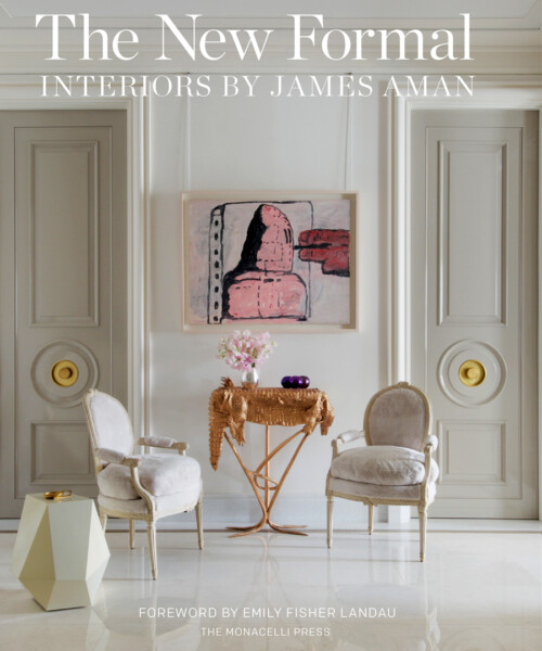
Looking at the Park Avenue co-op gracing the cover of the just-published The New Formal: Interiors by James Aman, one might be forgiven for thinking that the interior designer has a particular knack for designing around impressive art collections. The pale parchment walls and the metallic leather chairs of the dining room, for example, seem the perfect backdrop to the Frank Stella hanging on one wall. And it’s nearly impossible to imagine any room suiting the owners’ John Currins better than the peacock-blue, bronze-accented library—which is, like the paintings, at once formally lovely and slightly outré.
But Aman insists that he “would never, ever design around a piece of art.” His clients’ collections grow and change all the time, so the design must be able to stand on its own. “A beautiful environment is a beautiful environment,” he says. “If you took all the art away, it would still have to look good.”
Which makes the 10 interiors featured in The New Formal all the more impressive. Art, architecture and design complement one another; they also excel alone—a feat that Aman accomplishes by holding the interiors to the same standard as the art. “The antiques, the fabric, everything needs to be as good as the collection,” he says.
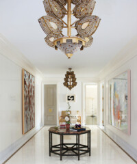
In the Park Avenue duplex—a gut renovation in a Rosario Candela building for a client who was adamant that the apartment retain its Rosario Candela sensibility, Aman looked for ways to heighten the drama. Very high, very un-Candela-like lacquered doors lend a sophisticated salon feel, while a key pattern in the foyer door and pearl detail around the base of the crown moldings convey an understated air of glamor that is nonetheless in keeping with the apartment’s classic persona.
The peacock blue library, meanwhile—lacquered in the manner of Brooke Astor’s famous red library—feels both old-fashioned and edgy, with an organic Claude Lalanne light fixture illuminating the controversial Currin painting of a topless Bea Arthur. “We always try to stay within the line of the transitional,” Aman says. “The whole aesthetic looks like a New York apartment, but it’s updated and it’s fresh and it’s young.”
In keeping with the classic contemporary feel, Aman’s partner John Meeks created bespoke embroidery designs for the textiles. Several light fixtures and pieces of furniture were also custom designed. In the bedroom, where a Will Cotton portrait hangs on one wall, a whimsical silver-leaf four-poster bed with a celadon horsehair headboard claims center stage, its palette echoed in a pale blue chair and draperies, with silver-leaf tea paper on the walls giving the room a pearlescent, restful aura. As Aman points out, “We wanted a flow, but it was also really important that each room have its own personality.” Personality, indeed.


